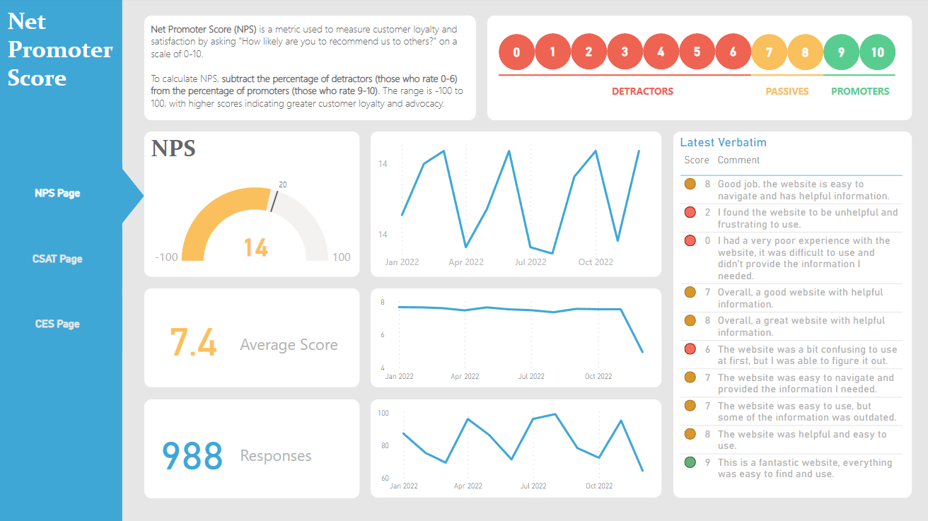
NPS Score for Executive Reporting
Please note that the purpose of this visualization demo is to showcase the approach to the problem. The main dashboard is more intricate, but it is proprietary and cannot be shared.
In my experience as a data analyst, I learned that creating effective visualizations requires understanding the needs of your audience. When tasked with building an NPS Power BI dashboard for executives, I focused on providing at-a-glance insights into customer sentiment.
Although the final dashboard had multiple pages with more filters, the focus remained on the at-a-glance consumption of customer sentiment. By keeping the dashboard simple and tailored to the executives’ needs, I provided practical insights but also allowed them to decide the extent to which they wanted the information.
This project taught me the importance of understanding your audience and adapting your visualizations to meet their requirements.
Some notes on style:
- I got feeedback on the main view being too text heavy. One approach that worked was to put the verbatim text more in the background by choosing a lighter color font, in this case, a light gray.
- I wanted the conditional format RAG colors on the verbatim table to match the scoring legend on the upper right corner by using Sandeep’s guide here but for some reason it did not work on my personal computer’s non-premium Power BI.
